Tag Archives: gen-

CO2 in atmosphere poised to blow past 400 ppm mark

CO2 in atmosphere poised to blow past 400 ppm mark

Shutterstock

Sometime soon, the concentration of carbon dioxide in the atmosphere is expected to hit a scary new milestone: 400 parts per million. That would be higher than at any time in human history — and it’s bad news for anyone who cares about a livable climate.

The latest daily average level recorded by Scripps Institution of Oceanography sensors at Mauna Loa, Hawaii, was 399.5 ppm, on Monday. The CO2 level fluctuates throughout the day, and hourly levels in excess of 400 ppm have already been recorded. The level also fluctuates throughout the year, with May being the month when CO2 reaches its highest concentrations.

The big thing to watch for is whether the average for the month of May will exceed 400 ppm.

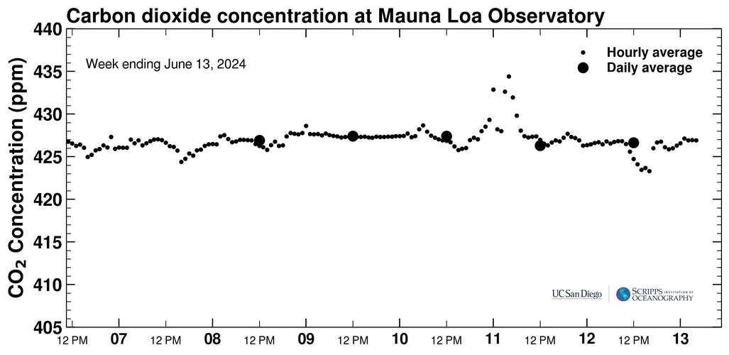
Check out this graph showing data from the past week:

Scripps Institution of Oceanography

Click to embiggen.

You can follow @Keeling_curve on Twitter to keep up with the latest figures.

From The Guardian:

“I wish it weren’t true but it looks like the world is going to blow through the 400ppm level without losing a beat. At this pace we’ll hit 450ppm within a few decades,” said Ralph Keeling, a geologist with the Scripps Institution of Oceanography …

“Each year, the concentration of CO2 at Mauna Loa rises and falls in a sawtooth fashion, with the next year higher than the year before. The peak of the sawtooth typically comes in May. If CO2 levels don’t top 400ppm in May 2013, they almost certainly will next year,” Keeling said.

Here’s a graph showing that sawtoothed rise, also called the “Keeling Curve,” named for Ralph’s father, Charles Keeling, who began taking measurements at Mauna Loa in 1958:

Scripps Institution of Oceanography

Click to embiggen.

From a statement published by Scripps last week:

Scientists estimate that the last time CO2 was as high as 400 ppm was probably the Pliocene epoch, between 3.2 million and 5 million years ago, when Earth’s climate was much warmer than today. CO2 was around 280 ppm before the Industrial Revolution, when humans first began releasing large amounts of CO2 to the atmosphere by the burning of fossil fuels. By the time [Charles] Keeling began measurements in 1958, CO2 had already risen from 280 to 316 ppm. The rate of rise of CO2 over the past century is unprecedented; there is no known period in geologic history when such high rates have been found. The continuous rise is a direct consequence of society’s heavy reliance on fossil fuels for energy.

From another Guardian article:

Climate scientists have long maintained that concentrations need to be kept below 350ppm if the world is to stand a reasonable chance of meeting international targets to keep average temperature increases below 2C, while concentrations of above 400ppm put the planet on track for levels of warming deemed ‘dangerous’ by the international community.

Hence that whole 350.org thing.

Carbon dioxide levels of 400 ppm in the atmosphere aren’t much more threatening than levels of 399 ppm. But the zeros focus the mind (and the media) on an extremely dangerous trend: Failure to act on climate change has pushed the world into yet another new danger zone.

John Upton is a science aficionado and green news junkie who

tweets

, posts articles to

Facebook

, and

blogs about ecology

. He welcomes reader questions, tips, and incoherent rants:

johnupton@gmail.com

.

Find this article interesting? Donate now to support our work.Read more: Climate & Energy

Also in Grist

Please enable JavaScript to see recommended stories

Read this article: 

CO2 in atmosphere poised to blow past 400 ppm mark

Posted in Anchor, FF, G & F, GE, ONA, Pines, solar, solar panels, solar power, Uncategorized | Tagged , , , , , , , , , , | Comments Off on CO2 in atmosphere poised to blow past 400 ppm mark

Kitchen Composting Works for Breakfast, Lunch and Dinner

One of the largest contributors to home-based composting piles is kitchen waste. Scraps from meal preparations as well as cooking supplies can be added to a compost bin and, in turn, contribute to your soil and mulch.

Composting guides generally sort matter into two categories, according to what they contribute to the process; green (nitrogen) and brown (carbon).

A lot of kitchen items are perfect for your pile. Here are just some of the more prevalent compostables from each meal of the day. To view the rest of this list, visit Plantea.com.

Photo: Earth911

Breakfast

Apple cores
Banana peels
Burned toast
Coffee grounds
Date pits
Egg shells
Grapefruit rinds
Oatmeal (cooked or raw)
Outdated yogurt
Stale or soggy breakfast cereal
Sunday comics
Tea bags and grounds
Soy milk
Watermelon rinds

Related: Fight Waste, Revive Stale Food with These Tricks

Lunch

Brown paper bags
Chocolate cookies
Freezer-burned fruit
Fruit salad
Peanut butter sandwiches
Peanut and other nut shells
Pickles
Popcorn
Pumpkin seeds
Stale potato chips

Read: 5 Ways to Pack a Zero Waste Lunch

Photo: Alexandra Vietti, Earth911

Dinner

Artichoke leaves
Cooked rice
Corncobs
Fish scraps, such as shrimp shells, crab shells and lobster shells
Freezer-burned vegetables
Jell-o
Old pasta
Olive pits
Onion skins
Pie crust
Potato peelings
Produce trimmings
Rhubarb stems
Seaweed and kelp
Spoiled canned fruits and vegetables
Stale bread and bread crusts
Tofu
Tossed salad

Supplies

Cardboard cereal boxes
Expired flower arrangements
Grocery receipts
Shredded cardboard
Matches (paper or wood)
Old spices
Paper napkins
Paper towels
Shredded newspapers
Wood chips and ashes
Wooden toothpicks

10 Things in Your Kitchen You Didn’t Know You Could Reuse or Recycle

Nate Lipka

Managing Editor

Like this story?

You’ll love our newsletters!

why join?

learn about the perks

earth911

Taken from:  

Kitchen Composting Works for Breakfast, Lunch and Dinner

Posted in eco-friendly, GE, Uncategorized | Tagged , , , , , , , , , | Comments Off on Kitchen Composting Works for Breakfast, Lunch and Dinner

Americans spent 4 percent of household income on gas in 2012

Americans spent 4 percent of household income on gas in 2012

In 2012, Chevron made $26.2 billion in profits. Exxon, $44.9 billion. Shell, $26.59 billion. At today’s prices, that’s enough to buy almost 25 billion gallons of gas in California.

Last year, Americans paid record-high average gas prices, a fact that is certainly linked to the oil companies’ massive profits.

How much did Americans spend on gas? From the U.S. Energy Information Administration:

Gasoline expenditures in 2012 for the average U.S. household reached $2,912, or just under 4% of income before taxes, according to EIA estimates. This was the highest estimated percentage of household income spent on gasoline in nearly three decades, with the exception of 2008, when the average household spent a similar amount. Although overall gasoline consumption has decreased in recent years, a rise in average gasoline prices has led to higher overall household gasoline expenditures.

EIA

Click to embiggen.

Four percent of household income went to gasoline in 2012. But here’s the kicker:

U.S. gasoline consumption fell in 2011 to 134.2 billion gallons, its lowest level since 2001. However, at the same time, EIA’s average city retail gasoline price rose 26.1% in 2011, and another 3.3% in 2012, when it reached $3.70 per gallon. The effect of the higher prices in 2011 and 2012 outweighed the effect of reduced consumption.

We are paying more for gas even though we’re using less. Allowing just three oil companies to rake in nearly $100 billion in profits.

Hat-tip: Ed Crooks.

Philip Bump writes about the news for Gristmill. He also uses Twitter a whole lot.

Read more:

Business & Technology

,

Climate & Energy

,

Living

Also in Grist

Please enable JavaScript to see recommended stories

Originally from: 

Americans spent 4 percent of household income on gas in 2012

Posted in GE, Uncategorized | Tagged , , , , , , , , , , | Comments Off on Americans spent 4 percent of household income on gas in 2012

How to get absolutely freaking (almost) everywhere in California without a car

How to get absolutely freaking (almost) everywhere in California without a car

Outside of its cities (and inside a lot of them, too), California is a typical car-happy American state, with about .84 cars for every person. With its miles and miles of looping roadway and ingrained car culture, it can be easy to forget how many other forms of transportation there are in the Golden State, too.

Enter the California Rail Map, one giant badass master map of California’s trains, buses, and ferries, showing routes to 500+ destinations throughout the state.

Click to embiggen.

Hey, look at that, you can take the train all the way from Oakland to Tijuana. Of course, it doesn’t say how long it’ll take to get there … See you guys next week!

Susie Cagle writes and draws news for Grist. She also writes and draws tweets for

Twitter

.

Read more: Uncategorized

Also in Grist

Please enable JavaScript to see recommended stories

Visit source:  

How to get absolutely freaking (almost) everywhere in California without a car

Posted in GE, Uncategorized | Tagged , , , , , , , , , | Comments Off on How to get absolutely freaking (almost) everywhere in California without a car

Exxon’s predictions for 2040: More oil use, more electricity use, more, more, more

Exxon’s predictions for 2040: More oil use, more electricity use, more, more, more

The first thing you should know about Exxon’s 2013 “Outlook For Energy” report, the latest in an annual series that makes predictions about energy use to 2040, is that climate change is mentioned twice. In both cases, the expression is followed by the word “policies.”

So, with that big grain of salt, an oil tanker-sized grain of salt, what does Exxon portend for energy use on our little, warming planet? The toplines:

“Efficiency will continue to play a key role in solving our energy challenges.” Energy use by developed nations will stay flat.
“Energy demand in developing nations [those not in the Organisation for Economic Co-operation and Development, or OECD] will rise 65 percent by 2040 compared to 2010, reflecting growing prosperity and expanding economies.” This increase will mean a 35 percent rise in energy demand globally.
“With this growth comes a greater demand for electricity.” This increased demand for electricity will account for half of the overall increase in demand for energy.
“Growth in transportation sector demand will be led by expanding commercial activity as our economies grow.” Exxon will keep making money off cars and shipping …
“Technology is enabling the safe development of once hard-to-produce energy resources, significantly expanding available supplies to meet the world’s changing energy needs.” … and fracking.
“Evolving demand and supply patterns will open the door for increased global trade opportunities.” North America will start exporting oil.

I mean, that’s pretty grim, if predictable. As living standards increase, so does energy use. And even if the largest energy users — read, greenhouse gas emitters — level off (which is questionable), growth elsewhere in the world more than makes up for it. So by 2040, the world, warmer thanks to what we’ve already emitted, will keep adding to greenhouse gas pollution as it adapts to shifts in climate — and 2 billion more people.

The problem is summarized in these graphs:

Click to embiggen.

OECD CO2 emissions drop; non-OECD emissions rise. That’s that. Thanks for visiting our planet, hope you enjoyed your stay.

In fact, by 2040 demand for energy in non-OECD countries will be twice that of OECD countries …

Click to embiggen.

… largely due to residential electricity use.

Click to embiggen.

Generation of that electricity will come mainly from coal until 2025. Renewables will be a slowly growing part of the mix.

Click to embiggen.

This is a pretty remarkable look at fuel use over time. Even in 2040, more than 80 percent of fuel consumption will be from non-renewable sources, Exxon believes.

Click to embiggen.

Exxon does consider the effects of a carbon tax or other carbon price (though it insisted this morning that it isn’t seeking one). It expects such taxes will be in place in various countries by 2040 (note the subtle red/yellow/green coloration).

Click to embiggen.

It also estimates how fuel prices will be affected as a result. With a tax in place, coal will be more expensive than anything but solar, according to Exxon — though that doesn’t include the “reliability cost” of renewable sources.

Click to embiggen.

Here’s what Exxon cares about the most: oil use.

Click to embiggen.

For Exxon, sunny days are here to stay. Which is bad news, because the heat from that sun is increasingly being trapped in our atmosphere by greenhouse gases, slowly but surely upending life as we know it.

And there’s your real prediction for 2040.

Source

The Outlook For Energy: A View To 2040, ExxonMobil

Philip Bump writes about the news for Gristmill. He also uses Twitter a whole lot.

Read more:

Business & Technology

,

Climate & Energy

Also in Grist

Please enable JavaScript to see recommended stories

Excerpt from:

Exxon’s predictions for 2040: More oil use, more electricity use, more, more, more

Posted in GE, Uncategorized | Tagged , , , , , , , , , , , | Comments Off on Exxon’s predictions for 2040: More oil use, more electricity use, more, more, more

Gotta wear shades: Solar installations hit new annual record

Gotta wear shades: Solar installations hit new annual record

Year-over-year solar installations in the U.S. are up! Again! Up up up!

Greentech Media

Click to embiggen.

From Greentech Media:

[T]he U.S. solar photovoltaics (PV) market installed 684 megawatts in the third quarter (Q3) of 2012, representing 44-percent growth over the same period last year. This quarter marked the third largest on record for the U.S. PV industry and raised the total installed capacity through the first three quarters of the year to 1,992 megawatts — already surpassing 2011’s annual total of 1,885 megawatts.

Cumulatively, there are now 5.9 gigawatts of PV (which converts sunlight directly into electricity) operating in the U.S. from more than 271,000 installations. Combined with concentrating solar power facilities (CSP), which convert the sun’s heat to electricity, there are more than 6.4 gigawatts of solar electric capacity installed in the U.S., enough to power more than one million average American households.

But! Fox News is worried! “California doubles down on solar power, as critics question cost, job results.” Oh no!

Shutterstock

Your internet lesson for the day: This is what is known as “concern trolling.” Fox News is not legitimately worried that perhaps solar power — which it thinks is great, mind you! — is suffering setbacks. No, Fox News wants to see solar power vanish in a gigantic gasoline-fuelled fireball because renewable energy goes against Republican party orthodoxy.

The Fox story contains this paragraph:

Solar also promised to be a cheap source of power, fueled by the sun. What the industry didn’t say is the technology only converts a fraction of the sun’s energy, and the intermittent nature of sunshine does not produce the power promised.

“What the industry didn’t say is the technology only converts a fraction of the sun’s energy.” Saying that was maybe unneccessary? The sun, it turns out, is an incomprehensibly massive, fusion-reaction-powered star. Every second, it buffets the Earth with enough energy to fuel our current demands for thousands of years. So, yeah, solar panels don’t capture all of that energy.

And:

While solar has been painted an environmentally clean power, especially when compared with carbon-based fossil fuels, it is not without impact and growing opposition among preservationists.

I mean, what do you say to that?

Solar power generation and capacity continue to grow in the United States. If you’re unclear on why that’s a good thing, change the channel.

Philip Bump writes about the news for Gristmill. He also uses Twitter a whole lot.

Read more:

Business & Technology

,

Climate & Energy

Also in Grist

Please enable JavaScript to see recommended stories

Read original article: 

Gotta wear shades: Solar installations hit new annual record

Posted in GE, LG, Uncategorized | Tagged , , , , , , , , | Comments Off on Gotta wear shades: Solar installations hit new annual record

The fracking boom, as told in six railroad industry graphs

The fracking boom, as told in six railroad industry graphs

You can learn the story of the fracking boom by looking at one set of data: railroad shipments. Because, you know, it’s 1890.

Our Lisa Hymas explained how and why oil companies are increasingly relying on rail shipments; in short, no new pipelines plus a huge spike in extraction. But how big is that spike? Here is how the Association of American Railroads depicts it [PDF].

Association of American Railroads

Or, if you prefer, here’s the percentage change in carloads of petroleum, year over year.

Association of American Railroads

And in raw number:

Association of American Railroads

The main reason for this boom is fracked oil from the northern Plains states (something we’ve also discussed previously). Fracking requires lots of sand, used to hold open the fissures through which gas and oil make their way to the surface. So as fracked oil has increased, so have rail shipments of sand.

Association of American Railroads

Fracking natural gas has also meant significant declines in coal use. Since you can’t ship coal through a pipeline (very quickly), rail carloads are a good indicator of the strength of coal. Doing so, we see that 2012 has been a particularly bad year for coal.

Or, more starkly:

Association of American Railroads

There you have it. The fracking industry, as told by railroad data.

Incidentally, I’ll note that that first graph, showing how much more oil was shipped in 2012 brought to mind this one we shared yesterday, showing how much warmer 2012 has been than any year prior.

Click to embiggen.

You’d be forgiven for thinking that the two graphs were somehow related.

Source

In One Chart, See Why 2012 Was A Historic Year For The US Oil Comeback, Business Insider

Philip Bump writes about the news for Gristmill. He also uses Twitter a whole lot.

Read more:

Business & Technology

,

Climate & Energy

Also in Grist

Please enable JavaScript to see recommended stories

Original link:  

The fracking boom, as told in six railroad industry graphs

Posted in GE, Uncategorized | Tagged , , , , , , , | Comments Off on The fracking boom, as told in six railroad industry graphs

The 2012 Arctic report card: We’re going to need some summer school

The 2012 Arctic report card: We’re going to need some summer school

Each year, the National Oceanic and Atmospheric Administration releases a “report card” for how the Arctic is doing. This year, the Arctic gets an incomplete and a notice to be signed by its parents stating that it will require tutoring.

Warning: sad polar bears.

The report focuses on two primary findings. First, that the year’s record ice loss comes despite a relatively unremarkable year, temperature-wise.

A major finding of the Report Card 2012 is that numerous record-setting melting events occurred, even though, with the exception of a few limited episodes, Arctic-wide it was an unremarkable year, relative to the previous decade, for a primary driver of melting — surface air temperatures. From October 2011 through August 2012, positive (warm) temperature anomalies were relatively small over the central Arctic compared to conditions in recent years (2003-2010). Yet, in spite of these moderate conditions, new records were set for sea ice extent, terrestrial snow extent, melting at the surface of the Greenland ice sheet, and permafrost temperature.

A reminder: Here’s how this year’s ice melt compared to the past.

Pettit Climate Graphs

Click to embiggen.

The unusually severe melt despite non-unusual temperatures is in part due to the feedback loop of melt itself.

A major source of this momentum is the fact that changes in the sea ice cover, snow cover, glaciers and Greenland ice sheet all conspire to reduce the overall surface reflectivity of the region in the summer, when the sun is ever-present. In other words, bright, white surfaces that reflect summer sunlight are being replaced by darker surfaces, e.g., ocean and land, which absorb sunlight. These conditions increase the capacity to store heat within the Arctic system, which enables more melting — a positive feedback.

The other main finding is that the melt of ice in the Arctic region is affecting the food chain.

A second key point in Report Card 2012 is that changes in the Arctic marine environment are affecting the foundation of the food web in both the terrestrial and marine ecosystems. …

For instance, new satellite remote sensing observations show the near ubiquity of ice-edge blooms throughout the Arctic and the importance of seasonal sea ice variability in regulating primary production. These results suggest that previous estimates of annual primary production in waters where these under-ice blooms develop may be about ten times too low. At a higher trophic level, seabird phenology, diet, physiology, foraging behavior and survival rates have changed in response to higher water temperatures, which affect prey species.

Changes in the terrestrial ecosystem are exemplified by vegetation and mammals. The tundra continues to become more green and in some locations above-ground plant biomass has increased by as much as 26% since 1982.

That change in surface vegetation has caused the lemming population to drop, which, in turn, has done the same to the Arctic fox, a species near extinction. At the same time, red foxes are migrating north, providing additional competition for shrinking food supplies.

So: That’s grim.

The report is loaded with graphs featuring lines that typically start at the upper left corner and then plummet down and to the right. It also contains interesting graphics like this one, showing the effect that an August storm had on ice breakup and melt near Alaska.

NASA

Click to embiggen.

It’s probably not really accurate to call this document a report card. It’s far more of a crystal ball, sort of an SAT gauging how the future might look. And it doesn’t look very good.

Philip Bump writes about the news for Gristmill. He also uses Twitter a whole lot.

Read more:

Climate & Energy

Also in Grist

Please enable JavaScript to see recommended stories

Read this article – 

The 2012 Arctic report card: We’re going to need some summer school

Posted in GE, Uncategorized | Tagged , , , , , , , , , , | Comments Off on The 2012 Arctic report card: We’re going to need some summer school

One way to slow Arctic ice loss: Stop flying over it

One way to slow Arctic ice loss: Stop flying over it

Right after Sept. 11, the lack of any airplane activity over the U.S. allowed scientists to study the effects of flights on the weather. In doing so, they found a direct correlation: Temperatures dropped when planes weren’t overhead. The science of the research is far more complicated than that simple statement, but it showed clearly that air traffic influences weather.

There’s another way in which planes likely affect the planet: by contributing to Arctic ice melt. From The Washington Post:

A new study [PDF] suggests one way that humans could slow the melting of the sea ice — by preventing international flights from crossing over the Arctic circle. These cross-polar flights are a surprisingly large source of black carbon pollution in the region. And if those planes diverted course, that could help fend off the day when the Arctic sea-ice collapses for good. …

[T]hese cross-polar flights are just a small source of the greenhouse-gas emissions that are warming the planet. But they are a significant source of pollutants like black carbon, which absorb sunlight and warm the region. And pollutants from cross-polar flights tend to linger in the Arctic for a particularly long time, in part because the planes fly through the stratosphere, a relatively stable layer of the atmosphere. (Indeed, such pollutants could explain why Arctic ice is vanishing so much faster than scientists even expected.)

According to the models used by researchers from Stanford and MIT, rerouting planes to avoid the Arctic Circle could cool the region by .015 degrees C and even increase sea ice.

Carbon output in the Arctic before (left) and after (right) rerouting. Click to embiggen.

The natural first question is how such changes in flight patterns would affect emissions elsewhere. After all, there’s a reason that planes fly over the Arctic: It’s faster. It’s faster because it’s a shorter route, and a shorter route means less fuel consumption.

The researchers spent a lot of time considering this; in fact, it consumes much of the paper. In summary:

Rerouting flights increased fuel use and total pollution emissions by 0.056 %, but most such emissions were removed faster by wet deposition because they were now over latitudes of greater precipitation and lesser stability. … The worldwide fuel plus operational cost of rerouting is estimated at ~ U.S. $99 million/yr, 47–55 times less than one estimate of the 2025 cost benefit to the U.S. alone resulting from reducing Arctic and global temperatures due to rerouting.

Effect of rerouting in miles and travel time. Click to embiggen.

Airlines aren’t likely to reroute flights unless they’re pushed by new laws and regulations. They won’t assume a $99 million annual burden willingly. And rerouting could add as much as two hours to some flights, an inconvenience that Delta isn’t going to impose on customers unless it’s forced to.

And there’s one other question: To what extent would this rerouting simply be tossing a few handfuls of sand on a long, slippery slope? How much time does a slight increase in summer ice buy us from the Arctic ice death spiral? However much, we’ll take it. We need every additional month — or week, or day — we can get.

Philip Bump writes about the news for Gristmill. He also uses Twitter a whole lot.

Read more:

Business & Technology

,

Climate & Energy

Also in Grist

Please enable JavaScript to see recommended stories

See original:

One way to slow Arctic ice loss: Stop flying over it

Posted in GE, Uncategorized | Tagged , , , , , , , | Comments Off on One way to slow Arctic ice loss: Stop flying over it

Renewable energy consumption is expected to keep rising in the U.S. — sort of

Renewable energy consumption is expected to keep rising in the U.S. — sort of

The U.S. Energy Information Administration has what seems, at first blush, like bad news. Renewable energy consumption in the U.S. is expected to drop 2.6 percent this year. Here’s a graph of the dip. (Note: Both the 2012 and 2013 values are estimates.)

Click to embiggen.

But buried in the data is the explanation: The drop is only due to hydropower “[beginning] to return to its long-term average.” Take out hydropower, and you have a 4.2 percent increase.

Click to embiggen.

But there’s another caveat. The estimates are based on two assumptions.

The first is that the wind production tax credit (PTC) is renewed. This is a pretty big “if.” The tax credit, you may remember, is a bolster that allows the wind industry to compete in the rigged production game with fossil fuels. Fossil fuel companies are eager to see the PTC expire as it’s slated to at the end of the month, with one Koch-allied group pushing hard on the issue. If the PTC isn’t renewed, it’s safe to assume that the projections above will prove to be far too optimistic.

That said, there is some good wind news today. The New York Times notes that the government is holding another offshore auction next year — but this time, for wind energy. How much is generated by that auction — in terms of money and electricity — depends on what happens on Capitol Hill by the 31st.

The other caveat in those EIA projections is that solar continues to grow at about 30 percent a year. The solar industry (whose own PTC is expiring at the end of 2013) isn’t sitting on its hands. Over the weekend, the Times reported on how the industry is taking a page from Tupperware in selling its panels.

Environmentalists, government officials and sales representatives have been trying to get Americans to go solar for decades, with limited success. Despite the long push, solar power still represents less than 1 percent of electricity generated in the United States. Home solar panel setups, which typically run $25,000 or more, are considered by many consumers to be the province of the rich or idealistic.

So now solar companies are adhering to a path blazed by Tupperware decades ago, figuring that the best sales people are often enthusiastic customers willing to share their experiences with friends and neighbors — and perhaps earn a referral fee on any sales that result.

It’s a smart strategy: As we’ve noted before, peer pressure shows a demonstrable effect on solar panel adoption.

And, finally, some context. Here’s the breakdown of energy consumption between renewables, nuclear, and fossil fuels.

A 4 percent increase in renewable consumption is better than a decrease. But it will take a whole lot of solar-ware parties before we’re actually making a real dent in our greenhouse gas emissions.

Philip Bump writes about the news for Gristmill. He also uses Twitter a whole lot.

Read more:

Business & Technology

,

Climate & Energy

,

Politics

Also in Grist

Please enable JavaScript to see recommended stories

See more here – 

Renewable energy consumption is expected to keep rising in the U.S. — sort of

Posted in GE, Uncategorized | Tagged , , , , , , , , , , , | Comments Off on Renewable energy consumption is expected to keep rising in the U.S. — sort of